design

Selecting a Color Theme for your Social Media Channels

I'm working with a new client, and it's been very fun. One of the first things I did when I took over their Instagram account is archive ALL their old content. Why? Because there was no rhyme or reason in the posting of images, no editing of photos and no general color theme. Sometimes it works that you can work without these things, but in this case, it didn't. Their engagement was non-existent and the images that were shared did not tell a story about the business. 

Social Media Short: you can seemingly 'delete' photos from your Instagram feed by archiving them. This is good if you want to play around with your theme, test a new posting strategy, or just don't like what you had posted way back when. To do this, on the upper right side of the image select the three dots, and then from the drop-down menu, select archive. 

After spending some time in my clients' shop (it's a home decor/gift shop) arranging, styling and photographing product, I've spent the last week uploading images on a consistent schedule on both Instagram and Facebook and we've seen a noticeable jump in engagement, likes, and followers. Such a great feeling and the client is thrilled!

Selecting a color theme can be difficult and frustrating. When I'm hired to revamp a blog or social media channel, the first thing I do is study what they sell, taking into account the predominant colors they use and any company colors, logo designs, etc. I'm very visual, so I usually know what look I'm going for pretty quickly, and design content uploads to reflect this, scattering in some other content that fits within the scheme. 

There are quite a few websites out there to help you decide a color theme if that's not your thing. Of course, Pantone is the industry standard, and they have handy chip books and color guides you can purchase to help you get started. Many paint brands also have fan guides and you can sometimes get them for free from the retailers (however, I don't think they're doing this all that much anymore). A trip to Home Depot, Lowe's or any other home improvement store that sells paint is also a great place to start. Take a look at the paint chips, and many of them have some complimentary colors that can help you decide on a color theme. It's fun to grab a few ideas and play around with them later. 

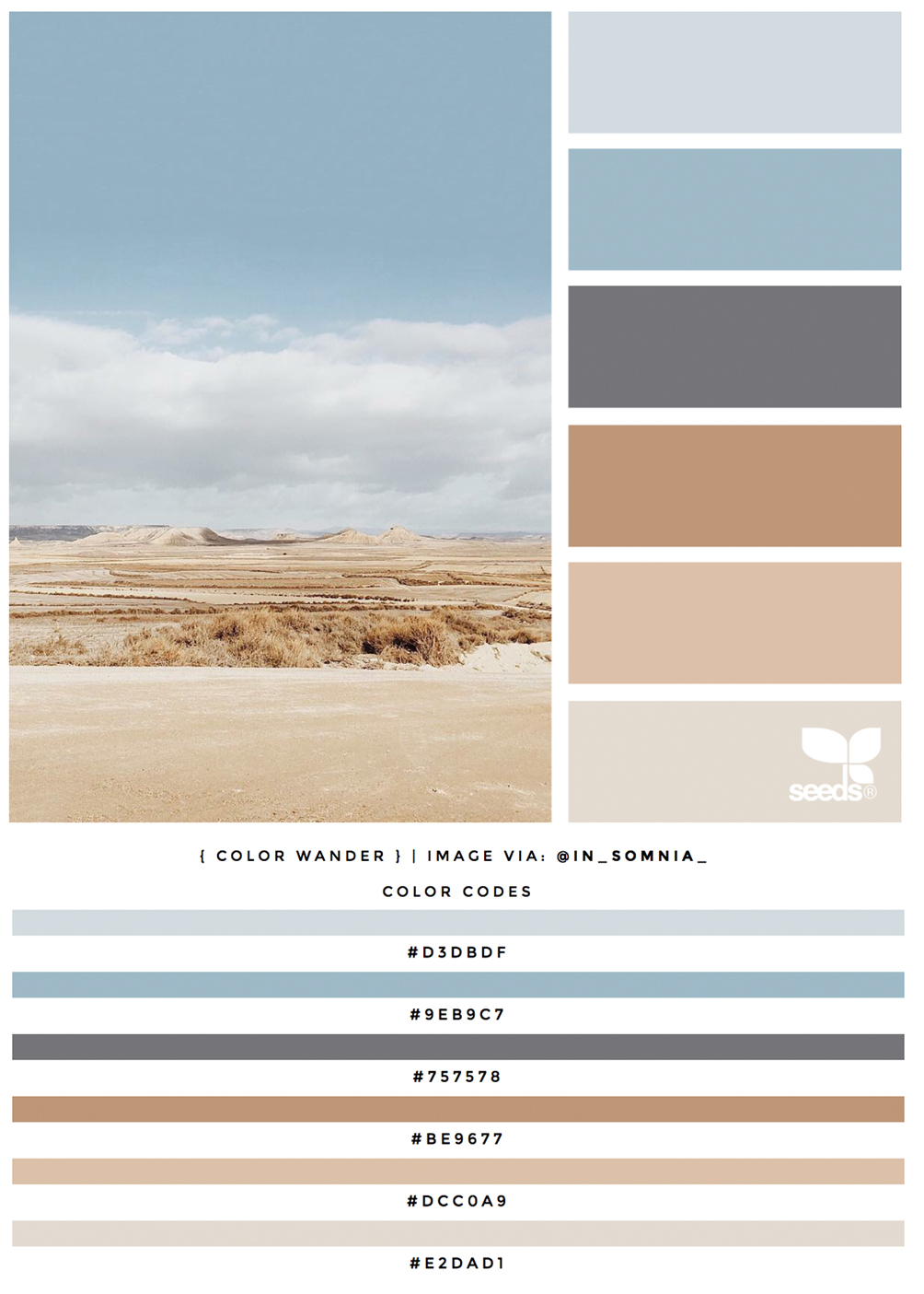
One resource I love is Design Seeds, a fantastic website of user-generated images that are paired with the real color codes so you select the actual color when designing in Photoshop, or any other image editing program. One of my favorite color combinations are blues and neutrals, and this palette is perfection.

ColorCodes.jpg

This particular palette is called Color Wander - see it all here.  If you are a color addict (like me!) take a look at Design Seeds for major inspiration! 

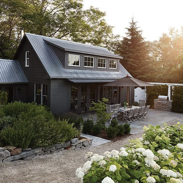
Crushing on the Black Farmhouse

tasmanian-lookout-house-4.jpg

I think I first encountered a black-sided home last year while we road tripped through New Zealand. We were there in March, which is their autumn, so the leaves were beginning to change and some of the grasses in the fields had gone brown. In that early dormant state, you’d think the landscape would be barren and cold. But no, it was organic and beautiful. And every once in a while, we’d be driving (and we’d be the only car on the road for miles) and we’d drive through a tiny little town. In fact, the only way you’d know it was town would be the lone post office or feed store that would be on the highway. Other than that, nothing! It was surreal and quaint and felt like such a throwback. We loved it.

Driving through those small towns on the South Island, we passed many farmhouses – some old, some new, some restored. But never had I seen so many painted black with steel roofs. They looked so utilitarian, yet so modern and contemporary.

We are now in our mid-50’s, and retirement is so close we can taste it. What’s been happening is that every little trip we go on, we begin to imagine what it would be like to retire to that place. Certainly, New Zealand gave us that fantasy, but it’s so far away, it really is unrealistic. This past weekend we were in Paso Robles, and I was thrilled when Scott mentioned that he would consider that region for our next chapter (add it to Santa Barbara, Santa Ynez, Palm Springs, San Diego & Amsterdam).

Of course, my mind started immediately wandering, and I started fantasizing about building a dream farmhouse, on a small plot of 10 acres with an established vineyard (ha!). I think a black farmhouse would be the perfect structure to stand out on the rolling hills and majestic fields of Central California. A girl can dream

NewZealand.jpg
fosters_matakana_black_barn_style_new_build1.jpg
071abb200862f69b9d1a17df82f95737_large.jpeg
Amber-Interiors-Client-Black-Houses-are-the-Best-Houses-15.jpg
tumblr_o7ssf5Q7LL1st4ekco1_1280.jpg
129.jpg

images 1 | 2 | 3 | 4 | 5 | 6 | 7

Architectural Tour: Schindler House Los Angeles

schindler-house.jpg

I love going into the city when time permits, not just for the urban adventure that it is, but there’s such an amazing concentration of cultural icons around almost every corner. Being a design junkie, I especially love stumbling upon something special.

This happened recently when my husband & I were in the city visiting my son & his friend in West Hollywood. We were walking to brunch, down Kings Road just north of Melrose Boulevard, when I saw a tiny little sign for Schindler House. I was not hugely familiar with R.M. Schindler, but I did know the name as a pioneer in the modernism era. After brunch, on our way back, we stopped in and toured this historic house.

SM-STREET.jpg

What  struck me first was that you would never know a historic home is located on this quiet and beautiful tree-lined street in bustling West Hollywood. The street is mainly apartment houses and condominiums, and Schindler House is set back from the street behind a fully mature bamboo hedge. There is just a small sign proclaiming its’ existence.

SchindlerHouseKingsRoad4.jpg

Schindler House Los Angeles, or the Kings Road House, as it is commonly known, was built in 1922 and was actually considered to be one of Schindler’s most important works. It is considered by many to be the first house built in the modern style, and was experimentally built for communal living, housing another couple besides the Schindlers.

SchindlerHouseKingsRoad2.jpg

The lot was divided into seven sections; four of them were assigned to each of the four inhabitants of the home to express their own individuality and there was a shared kitchen and outdoor sleeping areas (on the rooftop deck!). The structure draws upon European modern architecture (Schindler was Austrian) and, like many European buildings of that time, incorporated concrete, glass and wood in the construction of the home. This had become a popular trend in Europe thanks to Mies van der Rohe’s work in experimental concrete buildings in the 1920’s.

The only reason I remotely know this is because this house reminded me of my husbands late uncle, architect William Alexander, who designed and built the Hangover House for Richard Halliburton in 1938.

SchindlerHouseKingsRoad-bath.jpg

The residence was used for political, social and cultural events during the time they lived there, and was also used as housing for visiting artists, architects and writers (Frank Lloyd Wright and his son, Lloyd Wright, were frequent visitors). I can only imagine how astounding the guest list must have been during those days. The Schindlers eventually divorced, but the house continued to be a meeting place for left-wing political radicals in Los Angeles.

Today, the house is maintained and funded by the MAK Center for Art and Architecture Los Angeles at Schindler House. There are year-round events and exhibitions and programs geared toward the creative arts. When we were there, we were lucky to be treated to small Eames exhibit.

SH-Kings1.jpg
SH-Kings2.jpg
SH-Kings3.jpg

Schindler House is located at 835 North Kings Road, West Hollywood, CA 90069. It is open to the public Wednesday through Sunday, 11 am – 6 pm, and admission is $7.00.

It’s well worth the visit.

Top photo via The MAK Center for Art and Architecture L.A. All other photos my own.

Crushing on Frank Gehry

I was listening to NPR this morning at the gym, and there was a fantastic interview with Frank Gehry that really moved me. I am a total design junkie, and have been enamored with Mr. Gehry since the early 1990’s when he designed the Chiat/Day offices in Venice, California. The facade was shaped like a pair of binoculars, the center of which served as the entrance to the parking garage. At the time, I was working a couple of blocks away in Santa Monica, and would drive by everyday on my way to and from my office.

At the time, my obsession with design was new, and this eclecticism seemed so risky and different. I love it when people, designers and developers step outside the box. Since then, Gehry has gone on to design Walt Disney Concert Hall in Los Angeles, the Louis Vuitton Foundation outside of Paris, and the Guggenheim Museum in Bilbao, Spain. At 86, he is still pushing the envelop – check out the Dancing House in Prague!

Gehry.jpg

All the (well-deserved) attention is culminating the release of Paul Goldberger’s biography of Gehry, coming out on September 15, 2015. Golderberger, a friend of Gehry’s for over 40 years, chronicles the life of Gehry (born Frank Goldberg!) and shows the full spectrum of his work and how he single-handily changed the architectural world with his ingenious use of materials and form. This is one volume I can make room for in my bookshelf, and have already pre-ordered the book.

If you would like to listen to the story, I’ve embedded it below. I hope you do. Frank Gehry is such a pioneer.

book jacket image via NPR.